Case study · 03 / 03Edtech websiteUX/UI design
ApnaSchool
A course website that helps people pick the right level in seconds, then shows exactly what they will learn, who teaches it and when the next batch starts.
01Overview
ApnaSchool runs live UI, UX and Product Design courses for freshers and for designers with 1 to 10 years of experience.
The website had two jobs: help a student find the right course for their level, and help schools and academies start a design department with ApnaSchool. Every page leads to one of two actions: Register or Request a call.
Challenge
Sixteen courses across four tracks and four levels, without overwhelming a first-time visitor.
Approach
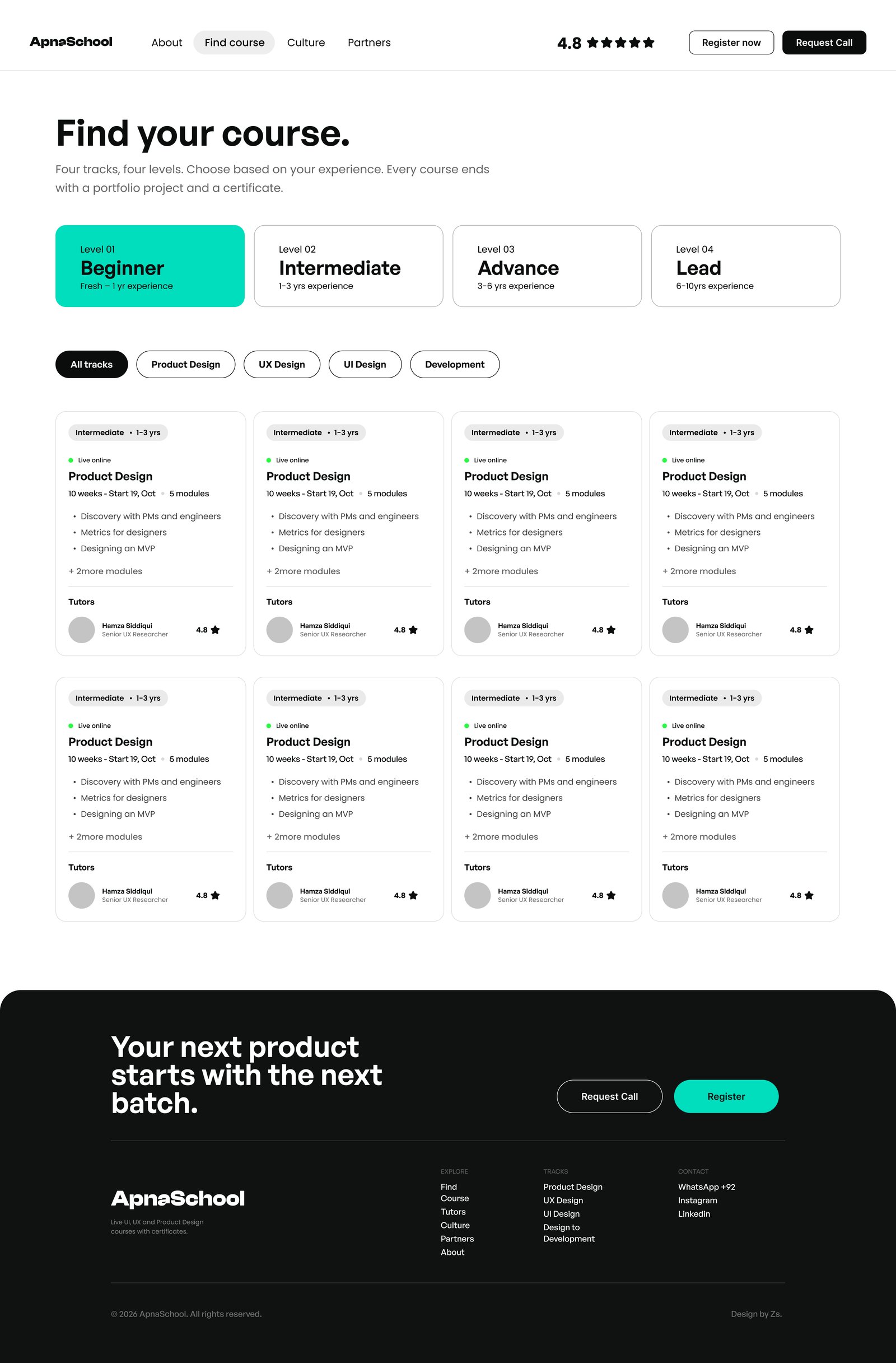
Level first, then track. Every course card shows length, start date, modules and tutor.
Outcome
Five pages with a direct path from "which course?" to "Register".
Levels, from Beginner to Lead.
Tracks: Product, UX, UI and Development.
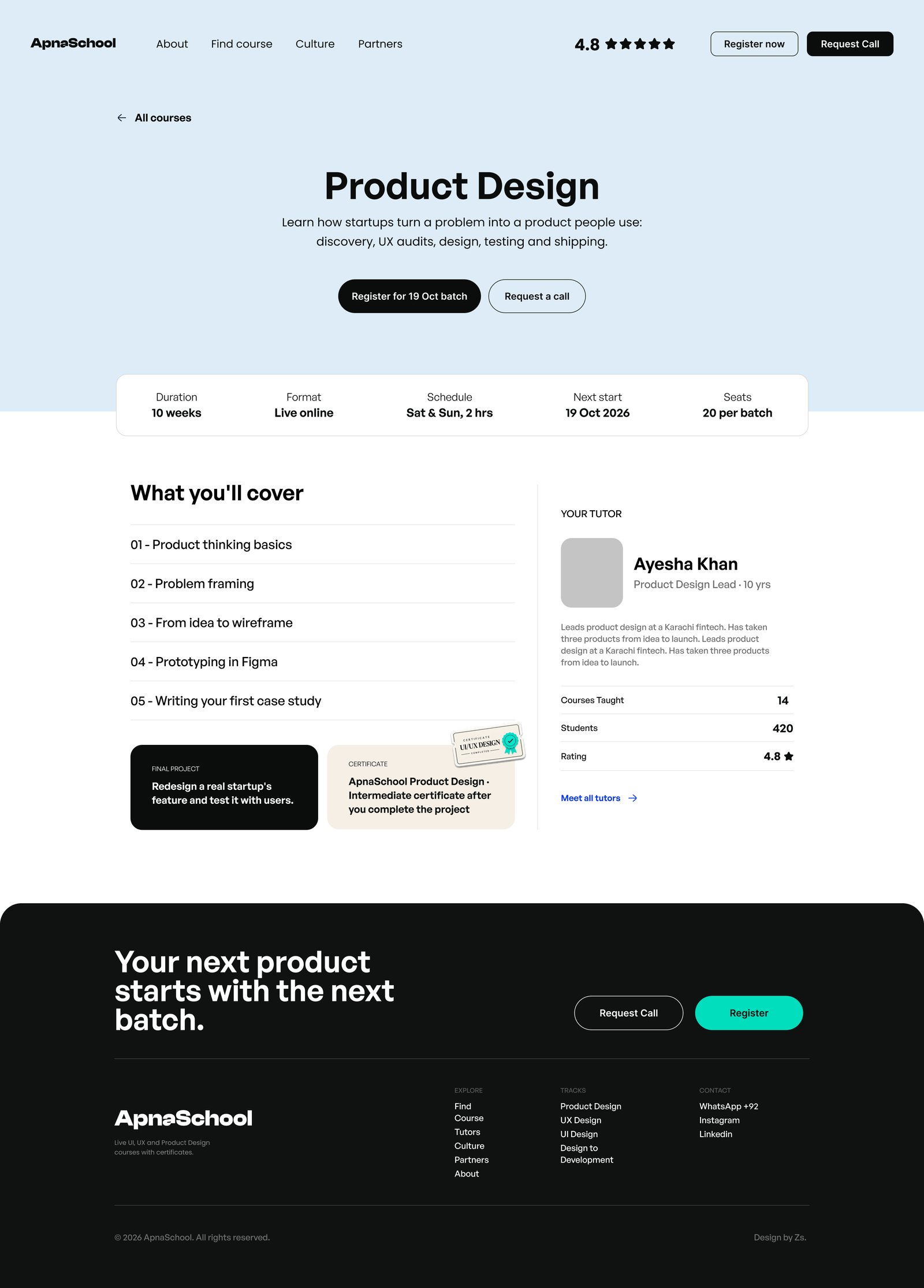
Facts on every course page: duration, format, schedule, start and seats.
Actions everywhere: Register or Request a call.
02Approach
Every course follows the six steps product teams use, at the depth that fits your level. The Culture page tells that story.
- 01
UX Audit
Review a live product and find where users drop off.
- 02
Research
Talk to users. Turn interviews and data into clear problems.
- 03
Define
Frame the problem, set success metrics, decide what to build first.
- 04
Design
Flows, wireframes and UI in Figma, with AI tools where they help.
- 05
Test
Prototype, test with real users, then fix what doesn't work.
- 06
Ship
Hand off to developers, launch, measure and improve.
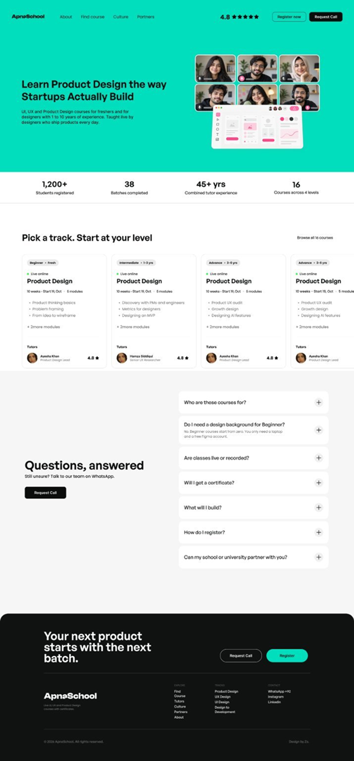
03Key screens
Four pages from the website.

04Design system
Friendly, clear and consistent.

05Deliverables
Pages
- Home
- Find course
- Course detail
- Culture
- Partners
UX
- Information architecture
- Level-first course finder
- Course page structure
UI
- Type & colour system
- Course and level cards
- Buttons, pills & chips
- Responsive layouts
Content
- Course facts
- FAQ
- Partner program
- Student stories
06All pages
One clear path across every page.