Case study · 02 / 03Fintech mobile appUX/UI design
(Project)
A financial wellness app that puts saving, Kommittees, bills, loans and insurance in one place, with a clear path from the home screen to every money task.
01Overview
Rizq by Rozee is a financial wellness app for salaried professionals and freelancers.
Everyday money tasks usually live in different places: one app to send money, a notebook for the family committee, paper bills and a separate insurer. Rizq brings them into one app. The design job was to make every task easy to find, easy to understand and easy to finish.
Challenge
Eight services in one app, without a crowded or confusing home screen.
Approach
One card per service, a plain one-line promise, and numbers shown before any commitment.
Outcome
Every task starts from the home screen and ends with one clear button.
Services on one home screen.
Ways to send money: RIZQ to RIZQ or bank transfer.
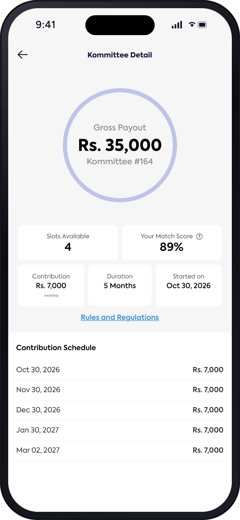
Facts before you join a Kommittee: slots, match score, contribution, duration and start date.
Insurance views: my cover and family cover.
02One home, eight services
Each service gets one card and one line.
 Save
SaveGoal envelopes to save and grow money for future goals.
 Kommittee
Join a trusted committee, pick your spot and get money when you need it.
 Loans
LoansAn EZ Loan whenever you need it.
 Freelance
Extra income from side hustles.
 Smart Bills
Pay and schedule bills, school fees, top-ups and insurance.
 Budget
Budget smartly and make your money work harder.
 Health
Health cover for you and the people you love.
 Business Card
Share your professional contact details in one tap.

03Approach
Six rules shaped every screen. Money is personal, so each screen had to feel familiar, honest and calm.
- 01
One home
All eight services sit on one screen as equal cards, so nothing hides in a menu.
- 02
A plain promise
Each card says what you get in one line: save, borrow, earn, pay or protect.
- 03
Familiar words
"Kommittee" is the word people already use for a saving circle with friends and family.
- 04
Explain first
Kommittee and Insurance open with a short video, so people understand before they sign up.
- 05
Numbers up front
Payout, open slots, match score and every payment date are visible before joining.
- 06
One clear action
Each form ends with a single Continue button at the bottom of the screen.
04Joining a Kommittee
The key journey, from the home screen to the payment schedule.

05Key screens
Sending money and health cover.


06Design system
Trustworthy indigo, a green for growth, soft lavender for everything else.

07Deliverables
Screens
- Splash
- Home (Newsfeed)
- Send Money
- Join a Kommittee
- Kommittee Detail
- Insurance
UX
- Service map
- Kommittee journey
- Send money flow
- Empty states
UI
- Colour & type
- Service icon set
- Cards, tiles & tabs
- Video banners
Content
- Service one-liners
- Kommittee explainer
- Insurance explainer
08All screens
Every money task starts from one home screen.